Wednesday, July 25, 2018

Less is More:

  • Less is more is the most well known phrase of the minimalist movement.
  • Keep good readability and usability by ditching all excessiveness.
  • Minimalist design about cutting the extra decorative and using fewest elements as possible.
  • Webdesign need high quality visual contents to communicate their messages effectively using very little visual content.
  • The minimalism is not a lack of something. Its simply the perfect amount of something.
How we get perfect amount of everything?

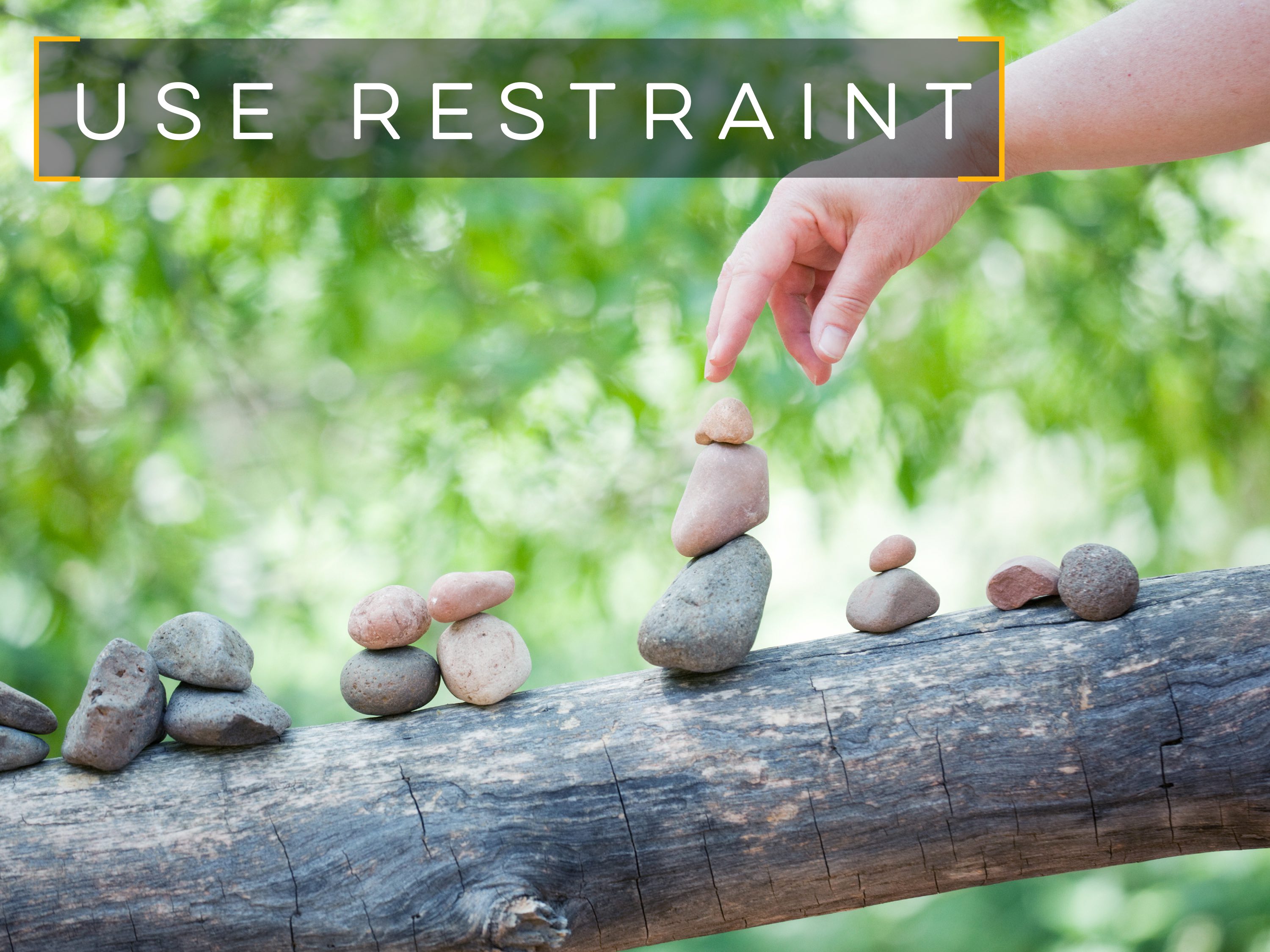
Use restraint: Perfect your visual content from becoming a cluttered mess by limiting the amount of content that you try to communicate with the visual.
Use restraint when it comes to typefaces and colors.
                       visual content ethos3 professional presentations

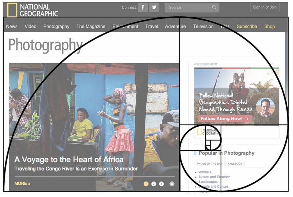
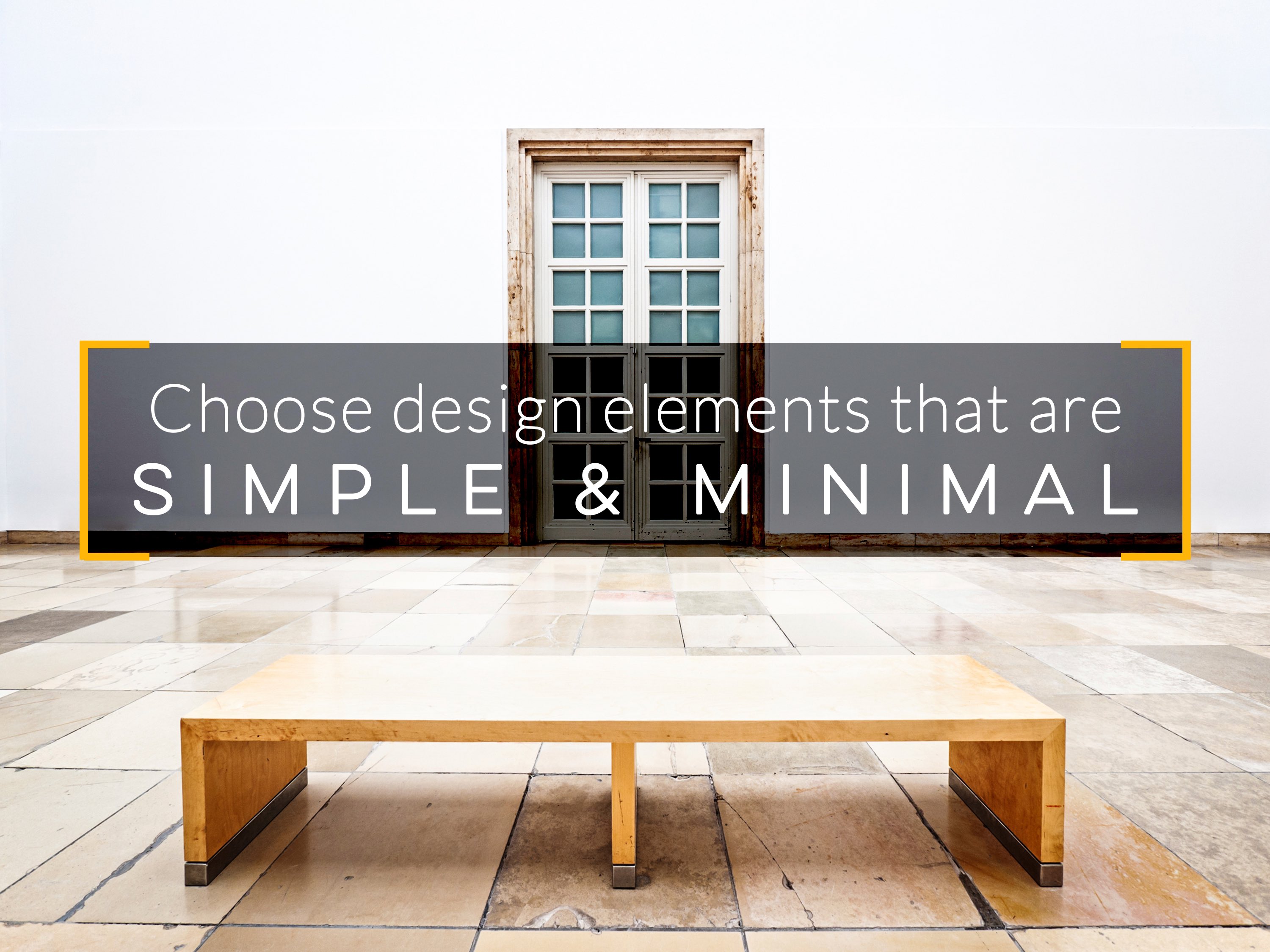
Choose design elements that are simple and minimal: To create minimalistic visuals set yourself up for success by selecting simple design elements, such as flat colors, icons and high resolution photos with a lot of white space.
Simple and minimal images or content shows easy understanding and increases the legibility and readability.
             visual content ethos3 presentation design

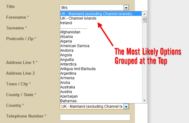
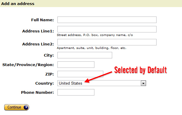
Choosing a single stand out element: When selecting minimalistic design elements, such as photographs, look for images that have one standout element. The standout element should give the viewers a meaningful and better understanding of that visual.
Users easily notice the what that image exactly says or what they contains.
                                 visual content ethos3 presentations

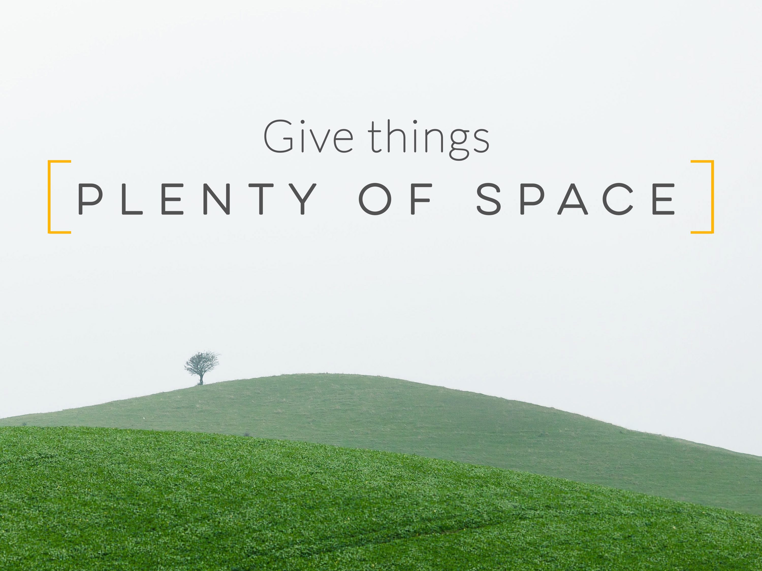
Give things plenty of space: To effectively highlight the most important elements in our design give plenty of space.
                            visual content ethos3 design 

Golden Ratio:

  • Golden ratio is a mathematical ratio commonly found in nature, and used in a classical design theory to create balance compositions, it roughly equals to 1.6180 is known as the golden ratio or golden mean or golden section.
  • Golden ratio is probably best understood as the proportions 1:1.618. It also referred as Greek letter phi(ϕ)
  • a/b=a+b/a=1.618...=Golden Ratio.
  • Golden ratio acts as a grid system to organize the layout in a unique way.
  • The Golden Ratio is used within graphic layouts of all kinds, especially to balance content that is text heavy.
  • It can help designers create hierarchy and draw users’ eyes to specific areas.
                                  
Golden Ration in webdesign:
  • By using the golden ration in web design, you become appealing to your viewers and unconsciously the layout of the website looks perfect for them as well as familiar.
  • Golden ratio is also used to balance the content.
  • Using golden ratio in web design to achieve beautifully balanced interface make people enjoy their experiences with your product.
  • These designs just look right and unconsciously they are pleasing to the users. Images, blocks of text, sidebars, buttons, etc and all be nicely placed in golden rectangles that form a perfect design.                        
Relation To Fibonacci Series:
  • The ratio itself is derived from the Fibonacci sequence. Golden ratio is similar to the Fibonacci sequence. Its a series of numbers when the next number in the sequence is the sum of previous two.
  • Example:0, 1, 1, 2, 3, 5, 8, 13, 21, 34, 55... 

                                 
                                              Forming of a golden rectangle

Image result for what is the  golden ratio in web design
How to uses the golden mean?

Images: Crop and size the pictures using golden ratio we will get perfect image.

                      golden ratio in web design

Logo: Shaped the logo using golden rectangle or triangle in website.
                             golden ratio in web design

Layout: Golden ratio is used to divide the space between the body of the website and sidebar.

golden ratio in web design

80/20 Rule:

  • The 80/20 rule is originally observed by Italian economist Vilfredo Pareto. Actual principle was named the Pareto Principle.
  • The 80/20 rule is also known as Pareto Principle. The 80/20 rule asserts that approximately 80 percent of results in a system come from 20 percent of the causes.
  • In webdesign it will reduce down to feature 20 percent the most rewarding and which produces 80 percent of whatever you want to achieve.
  • Do not spend too much time optimizing stuff that falls in the 80 percent that's not often used.
  •  Web design follows the 80/20 principle. It means that your website will have better user experience and more powerful content.
  • If you want better conversion rate your web site needs 80/20 optimization plan. You will get better results from your web site.
  • With a less complex webdesign you will achieve a much better conversion rate.                                      Related image
How to apply it?
  • First step you need to take is to identify what your main purpose is having a web site.
  • Keep refining your content by removing those elements that are not really necessary.
  • Analyse analytics and usability of data carefully to determine your 20 percent most used functions.
  • Focus on most important aspects of your website or web app enhance those.
           Reduce the selection time by placing a top selected items in first place

Fenn Wright Manson's most likely country options

  • Simplify your designs and layouts based on data that determines what falls under the 20 percent most used functions.
  • Remove noncritical functionality or content that's not used often.
  • Do not invest too much money and time optimizing lesser user functionality since the return on your investment likely be poor.
  • Pareto principle in web design makes your website more simplification, optimization and prioritization.
Its Importance:
  • All the advantages of applying the Pareto principle in web design will be better user experience, simpler and will have fewer distractions.
  • Page response times will be faster and your website will be better quality.
                                            Implementing a optimization

       Amazon's default country option
                                                                      

Tuesday, July 24, 2018

Focus in Pictures:

  • A Picture paints a thousand words. Effectively used images can help to drive more visitors to your website.
  • The human brain can correctly identify images in as a little as 100 milliseconds.
  • Image can also communicate instantly as our brain can interpret them much quicker than text.
  • Pictures have the power to create an emotional response in the audience.
  • A good clear image showing how the product works, solve problems, answer questions and sell well.
  • A good image or video can show someone what to do instantly and clarify problems with in a single shot.
Why we focus on pictures?

Websites with images get more views: According to one study that found online content with images get 94 percent views more than pages without.
Images bring your product or service to life: Heard the old expression its better to show than tell. Images in our website act as a storytellers allowing website visitors to visualize product or service. Carefully chosen images that reflect your product and values an important opportunity to quickly get users attention even before they have read a word of text.
Website images fuel social media: Great images can play major role when it comes to spreading the word about your local business in social media while other research found that social media posts that include images have higher engagement rates than text only posts.

Related image

                                Related image
                            Related image
    

Monday, July 23, 2018

PI and its Importance in Design:

  • Pi is the ratio of the circumference of a circle to its diameter.
  • Pi is often written using the Greek letter of π. π=Circumference/Diameter.
  • Pi is approximately is equal to 3.14 but pi is an irrational number.
  • π=22/7=3.14...
  • π=3.1415926535897932384626433832795028841972
                          circumference, diameter, radius
Importance of π in Design:
  • π is used for many different professions and assists in different aspects of design work.
  • Circles of different sizes in design are formed by formulae using π.
                     Related image

                                        Image result for pi importance in sphere

                             Image result for Ï€ using images
                     

Names to the Left:

  • Alignment is an important feature of web design. We have different alignments in web design.
  • Alignments are different types, those are, left-aligned, centered, right-aligned and justified.
  • Normally we align numbers to right for calculation easy from right to left and images are centered.
  • Text is always aligned to left why because left aligned text is easy to read than centered text for paragraphs.
  • Users can read each line simply moving their eyes to the left edge and left aligned text is easy for continue reading.
  • So, names are always to left will improve better understanding and readability.
                                           Simple example for left alignment

                   Image result for important images for left alignment in web design

                                          Showing about different types of alignments

Image result for left alignment images

                                 Simple examples for names to the left alignment in below tables

Related image

Image result for left alignment images


Saturday, July 21, 2018

Numbers Totaled:

  • Numbers totaled is mainly used in excel sheets. When there are decimal numbers in the list they are aligned so that their decimal points should be matched. This process in done in sheets like excel.
  • If you store such data as price lists or expense sheets in excel, you may need a quick to sum prices or amounts easily total columns in excel.
  • Easy to calculate sum or other functions in that numbers as shown in below.
Simple examples for how to totaled the numbers in excel sheet:

See the sum appear in your table

                          Related image

              Related image