Less is More:
- Less is more is the most well known phrase of the minimalist movement.
- Keep good readability and usability by ditching all excessiveness.
- Minimalist design about cutting the extra decorative and using fewest elements as possible.
- Webdesign need high quality visual contents to communicate their messages effectively using very little visual content.
- The minimalism is not a lack of something. Its simply the perfect amount of something.
How we get perfect amount of everything?
Use restraint: Perfect your visual content from becoming a cluttered mess by limiting the amount of content that you try to communicate with the visual.
Use restraint when it comes to typefaces and colors.

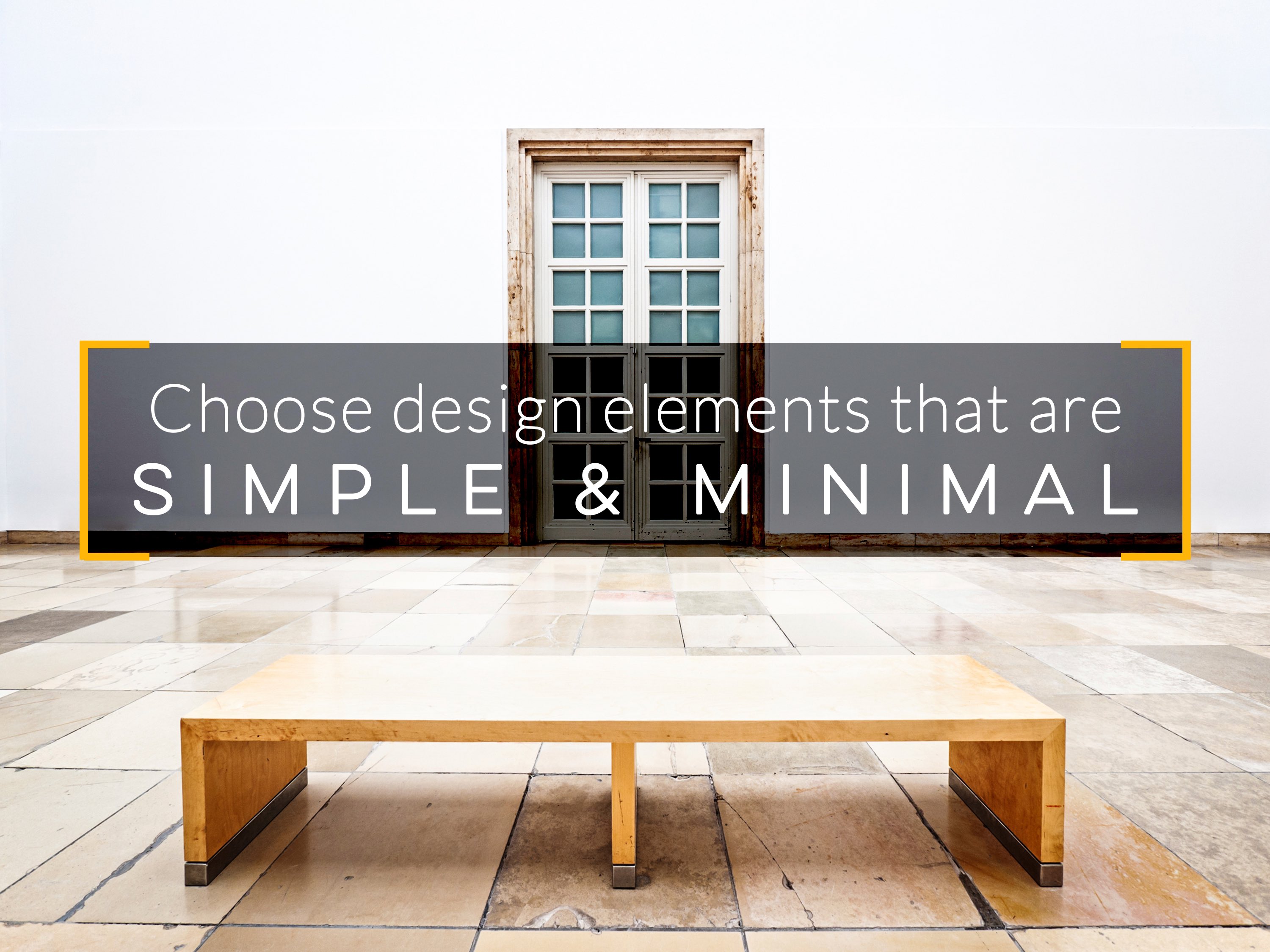
Choose design elements that are simple and minimal: To create minimalistic visuals set yourself up for success by selecting simple design elements, such as flat colors, icons and high resolution photos with a lot of white space.
Simple and minimal images or content shows easy understanding and increases the legibility and readability.
Simple and minimal images or content shows easy understanding and increases the legibility and readability.

Choosing a single stand out element: When selecting minimalistic design elements, such as photographs, look for images that have one standout element. The standout element should give the viewers a meaningful and better understanding of that visual.
Users easily notice the what that image exactly says or what they contains.
Users easily notice the what that image exactly says or what they contains.

Give things plenty of space: To effectively highlight the most important elements in our design give plenty of space.
